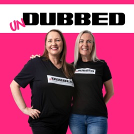
Advertise on podcast: unDUBBED
This podcast has
41 episodes
Language
EnglishExplicit
Yes
Date created
2024/10/29
Latest episode
2026/08/01
Average duration
57 min.
Release period
18 days
Description
Unscripted. Uncensored. Undeniably data! The podcast where data dreams get real! We're breaking down the secrets of data brilliance, diving into the messy & magical moments of data life, from AI to simple reporting, sales and data careers. Nothings off the table! Join us for stories, insights & a few laughs with innovators from around the world. If you're ready to unmask the data game, this one’s for you!
Unlock unDUBBED podcast Email contact info,
Listeners & Audience details
Email contact information
Direct podcast contact details

Listeners
Audience numbers & engagement insights

Audience details
Podcast Insights

Podcast episodes
Check latest episodes from unDUBBED podcast
D41 Where Tableau Insights Live: Headless AI and Slack
2026/08/01
Summary
In this episode, Steve Holley, a Tableau Solutions Engineer at Salesforce, shares insights on the evolving landscape of headless analytics and AI, the importance of trust and governance in data, and how organizations can adapt to rapid technological change.
Keywords
Data Analytics, Headless AI, Tableau, Salesforce, Data Governance, AI in Business, Data Transformation, Analytics Tools, Data Strategy key topics Headless analytics and AI Data governance and trust Real-time data insights and alerts Semantic models and data sources Organizational change management in data guest name Steve Holley
Titles
The Future of Headless Analytics and AI in Business
How Salesforce is Shaping Headless Data Solutions
Chapters
00:00 Introduction to Undubbed Podcast
02:00 Meet Steve Holley: Tableau Solutions Engineer
03:11 The Impact of AI on Data Interaction
03:28 Understanding Headless Analytics and AI
06:54 The Role of Dashboards in Data Analysis
09:56 Trust and Accuracy in AI Insights
15:16 Live Demo: Data Interaction in Slack
19:51 Understanding Dashboard Insights
21:41 Identifying At-Risk Accounts
23:33 Defining Business Rules and Context
25:49 The Role of Data Professionals
30:10 Adapting to New Data Workflows
33:31 Change Management in Data Analysis
35:31 Taking Action on Insights
41:11 Learning from Others in the Community resources Salesforce
Links
Official Website - https://www.salesforce.com/
Tableau Official Website - https://www.tableau.com/
Y, W A I I - Knowledge Mapping Tool - https://www.ywaii.com/
Steve's LinkedIn - https://www.linkedin.com/in/steveholley/
Steve's Twitter - https://twitter.com/steveholley
D40 Why AI Fails at Enterprise Data and What Tableau Is Doing About It
2026/07/06
Episode Summary
Dive into the evolving world of data, AI, and analytics with Will Pitzler, Director of Product Management at Tableau. This episode explores how Tableau is breaking down barriers to make insights accessible across platforms, the importance of governance, and what it actually takes to become a data-driven organisation.
In this episode, you'll learn about:
● Why leading LLMs scored just 6% on a Yale benchmark testing real enterprise databases and what that means for your AI strategy ● The role of composable data sources, the most requested feature in Tableau's history, and what they unlock for data teams ● How Tableau insights are now accessible directly inside Google Sheets, PowerPoint, Google Slides, and Word ● The uncomfortable questions around PII, data sovereignty, and governance when using MCP and third-party AI tools ● The Open Semantic Interchange initiative, what it is, why it matters, and how far away a real standard actually is ● What data leaders should actually do before their next AI project kicks off
Timestamps:
00:00 - Introduction and welcome
01:22 - Will's background and role at Tableau
03:31 - Why TC26 felt different, the return to the practitioner
06:00 - The developer spectrum and Tableau's broad user base
06:30 - Tableau through the Salesforce acquisition, what's changed and what hasn't
09:42 - TC26 comes to Sydney, bringing the insights to local customers
10:32 - The Yale Spider 2.0 benchmark and the 6% problem
13:50 - Why context is everything for LLMs in enterprise environments
15:18 - PII, data sovereignty, and the governance gap in AI and MCP
18:08 - What data leaders are actually telling Will on the ground
19:39 - Open Semantic Interchange, the industry's attempt at a common standard
21:17 - Two schools of thought on how Tableau handles semantic layers
23:23 - Delegated semantics, Tableau's interim approach
26:06 - How the data market has gone in circles, monolithic to modern and back again
28:30 - Composable data sources, the most requested feature in Tableau's history
33:10 - Governance and ways of working as teams move faster
35:25 - The last mile problem, insights shouldn't live only inside Tableau
38:44 - Staying in the flow, self-service where people actually work
39:32 - The tension between AI text outputs and data visualisation
42:02 - Demo begins, third party integrations overview
44:38 - Demo: Tableau inside PowerPoint
46:09 - The timestamp feature and refreshing slides on demand
47:19 - Salesforce internal use case, automating operational reporting
50:40 - Why live dashboards weren't the answer
52:06 - Demo: Tableau inside Google Sheets
55:27 - Using published data sources in Google Sheets
56:58 - Licensing and permissions
57:22 - Pushing data back into Tableau from Google Sheets
59:48 - The Henry Ford problem, what customers say vs. what they need
1:02:28 - Closing question: What should a data leader actually do?
1:03:16 - Where to find Will
1:03:38 - Fi and Sarah's closing takeaways
Resources & Links:
Connect with Will on LinkedIn https://www.linkedin.com/in/will-pitzler-603b915b/
Spider 2.0 Benchmark, Yale https://spider2-sql.github.io/
Tableau Add-on for Google Workspace https://www.tableau.com/blog/improve-collaboration-tableau-google-workspace
Tableau App for Microsoft 365 https://www.tableau.com/blog/meet-tableau-app-for-microsoft-365-word-powerpoint-teams
D39 What's Coming in Tableau: A Leader's Guide to the Best of TC26 with Candi and Kirk Munroe
2026/07/05
Summary
Fresh from Tableau Conference 2026, Fi and Sarah sit down with Kirk and Candi Munroe - co-founders of Paint with Data, a Tableau consultancy and Salesforce partner based in Canada - to unpack what's actually coming for Tableau and what it means for the people making decisions about their data teams.
Kirk brings 25 years in business analytics, a newly minted Tableau Visionary title, as well as a Tableau Ambassador and a book on data modelling in Tableau. Candi is a Visual Analytics specialist, four-time Tableau User Group Ambassador, and heads up the Canada Tableau User Group. Between them, they've seen every era of Tableau - and they're genuinely excited about this one.
The conversation covers Tableau Solve and its write-back and forecasting potential, the Viz layers that will let you layer multiple data sources on a single chart axis, composable data sources and why they're the missing piece in Tableau's semantic layer story, agentic analytics and what it actually takes to make natural language querying work in practice, Tableau MCP - including a cautionary tale about a CPM field that cost 58 cents a query - and what the Devs on Stage roadmap means for the data leaders who need to decide what comes next for their teams.
Takeaways
Tableau Solve productionises record-level triage and forecasting - and write-back is finally coming, with Kirk calling it "way, way, way overdue"
Chart Layers will allow multiple data sources to sit on the same XY axis without any joining, opening up time series comparisons and complex formatting that previously required workarounds
Tableau Server is getting genuine love - including LLM features - signalling that Tableau sees it as a long-term platform, not a migration waiting to happen
Composable data sources let analysts extend a published data source on the fly without touching the original, and because everything is relationship-based, nothing already built gets broken
Well-governed, well-commented data sources are now a prerequisite for agentic analytics - without them, the AI will guess wrong and cost you money (Kirk's CPM example is a must-hear)
Tableau MCP is already live, easy to set up in Claude Desktop in under three minutes, and keeps row-level security intact - but you need your own personal access token, not a service account
AI-assisted field descriptions get you 90-95% of the way there - the blank box problem is real, and the AI solves it
The Tableau Desktop Authoring API is in its third release, and style guide automation - padding, corner rounding, colour palette - is close
Headless BI and Slack-first data experiences are coming, and they matter most for the people who will never naturally log into Tableau
Data leaders should position themselves as connective glue across departments - spotting correlations between silos that no single team can see
Chapters
00:00 Introduction to Tableau Conference 2026 Highlights
01:52 Meet the Experts: Kirk and Candi
03:32 Exciting Announcements from TC26
05:40 Tableau Solve: Enhancements and Features
07:52 The Importance of Write-Back Functionality
09:31 Map and Chart Layers: A New Era in Visualization
11:51 Tableau Server vs. Tableau Cloud: The Future
13:19 Tab Move: Streamlining the Transition to Cloud
15:05 Accessibility Features in Tableau
15:18 Composable Data Sources: Unlocking New Potential
20:47 Optimizing Data Integration in Tableau
22:17 The Future of Composable Data Sources
24:22 Leveraging AI for Data Management
26:30 The Role of AI in Data Exploration
26:31 Understanding Agentic Analytics
29:52 Implementing Tableau MCP Effectively
34:24 Designing for Consistency in Data Visualization
36:54 Evolving Data Governance and Ethics
38:31 Exploring New Features in Tableau
39:08 The Future of Data Integration and Collaboration
48:26 Building a Data-Driven Organization
50:41 The Role of Data Leaders as Consultants
Links
Kirk Munroe on LinkedIn: https://www.linkedin.com/in/kirkmunroe/
Candi Munroe on LinkedIn: https://www.linkedin.com/in/candimunroe/
Paint with Data: https://paintwithdata.com
Paint with Data Blog: https://www.paintwithdata.com/blog
Data Modeling with Tableau by Kirk Munroe: https://www.amazon.com/Data-Modeling-Tableau-practical-building/dp/1803248025
Kirk Munroe on the Flerlage Twins blog: https://www.flerlagetwins.com/2023/01/data-.html
TC26 Devs on Stage: https://www.salesforce.com/plus/experience/tableau_conference_2026/series/tableau_conference_2026_highlights/episode/episode-s1e25
Watch TC26 on demand: https://www.salesforce.com/plus/experience/tableau_conference_2026
Fi Crocker on LinkedIn: https://www.linkedin.com/in/ficrocker/
Sarah Burnett on LinkedIn: https://www.linkedin.com/in/sezbee/
Keywords
Tableau Conference 2026, TC26, Tableau Solve, composable data sources, agentic analytics, Tableau MCP, Viz layers, chart layers, write-back Tableau, Tableau Visionary, data governance, Tableau Cloud, Tableau Server, AI in Tableau, semantic layer Tableau, data leadership, data leaders, Paint with Data, Kirk Munroe, Candi Munroe, Tableau data modelling, headless BI, Slack analytics, Tableau Desktop Authoring API, row-level security, Tableau prep, published data sources, Dub Dub Data, unDUBBED podcast
D38 Building Data Culture with Datafluencers
2026/05/16
Summary
Fresh off the stage at Tableau Conference 2026, Sarah Burnett and Fiona Crocker bring their live TC26 session straight to the unDUBBED audience. Their session was called Building a Data Culture with Datafluencers, and the whole premise is this: the best data work in most organisations will never be seen - not because it isn't good enough, but because nobody told the story.
They walk through why brilliant work disappears, who is responsible for fixing it, and the practical tools to start changing that this week. The centrepiece is the seven-part data story arc, walked through using Freshmart, a fictional wholesale food chain where waste was above target despite accurate data and capable teams.
Whether you're a data analyst whose work isn't getting the recognition it deserves, a manager trying to build a data culture, or someone who's ever built a dashboard that nobody used - this episode is for you.
Takeaways
The gap between delivery and adoption is where great data work disappears - and it's a storytelling problem, not a data problem
Great work goes invisible for three reasons: no channel, no story, and no leaders to promote it
A Datafluencer isn't a job title - it's a set of behaviours that makes work visible, shareable, and heard
The seven-part data story arc gives a repeatable structure: hook, problem, insight, solution, result, learning, call to action
One dashboard reframe - not a rebuild - saved Freshmart 2.4 tonnes of waste and $672,000 in annualised costs in six weeks
A public data wins channel builds culture over time - people stop lurking and start contributing when the space feels worth being in
Amplification is the step most people skip - make it one click for your manager, then prompt them to take it higher
Chapters
00:00 Introduction to Data Culture and Datafluencers
01:24 Understanding Why Data Work Goes Invisible
03:19 The Role of Datafluencers in Amplifying Work
05:39 Framework for Effective Data Storytelling
08:10 Building a Winning Channel for Data
10:56 Amplification and Cultural Impact of Data
13:43 Conclusion and Call to Action
Links
Data Fluencer Toolkit - https://www.dubdubdata.com/offers/iU2dFRBd/checkout
Fi Crocker on LinkedIn - https://www.linkedin.com/in/ficrocker/
Sarah Burnett on LinkedIn - https://www.linkedin.com/in/sezbee/
Keywords
data culture, Datafluencer, data storytelling, data visibility, Tableau Conference 2026, TC26, data story arc, dashboard adoption, seen heard promoted, data leadership
D37 How to Make Your Data Actually Matter with Cole Nussbaumer Knaflic
2026/04/20
In this episode of unDUBBED, we’re joined by Cole Nussbaumer Knaflic, founder of Storytelling with Data and one of the most influential voices in data storytelling and data visualisation.
Cole shares practical, real-world insights on why data often fails to drive decisions - even when the analysis is right - and how to shift from simply showing data to actually influencing outcomes.
From her journey through banking and Google’s People Analytics team to building a global data storytelling movement, this conversation is packed with actionable techniques to help you communicate data with clarity, purpose, and impact.
🔑 Main Topics
Why data fails to drive decisions - and how to fix it
The shift from showing data to explaining data
Audience-first thinking in data storytelling
Structuring communication using the narrative arc
The role of iteration, feedback, and time in crafting data stories
When to use dashboards vs storytelling
The risks and realities of AI in data visualisation
📌 In This Episode
Cole’s journey from banking to Google and founding Storytelling with Data
How data visualisation became a critical business communication skill
Why designing for yourself (not your audience) is the biggest mistake in data
The difference between exploring data vs explaining data
How to use titles, annotations, and contrast to guide attention
The power of low-fidelity prototyping and iteration for alignment
Why most data presentations follow a “selfish” structure - and how to fix it
Using the narrative arc to create tension and drive action
How to develop a clear “Big Idea” before building anything
The role of AI in data storytelling - speed vs risk, and hallucinations
Common chart mistakes, including unnecessary detail and poor audience focus
⏱️ Chapters
00:00 - Introduction to data storytelling with Cole Nussbaumer Knaflic
02:12 - Cole's journey from banking to data visualization at Google
03:45 - The importance of clear visual communication in business
06:46 - Teaching data visualization at Google and creating impact
08:45 - The storytelling ecosystem: books, workshops, community
10:48 - Making data concepts accessible and engaging
13:33 - The collaborative process behind “Storytelling with Data: Before and After”
17:17 - The power of the “before and after” in data improvement
18:10 - The storytelling process as a “glow up” for data
19:01 - Tools and techniques for rapid prototyping and iteration
20:41 - Strategies for understanding the audience and customizing communication
23:52 - Using low-tech methods for stakeholder alignment
27:03 - Balancing detail with clarity: avoiding overwhelm
29:54 - Differentiating between storytelling and dashboards
33:10 - Structuring data communication as a narrative arc
36:39 - The importance of concise messaging and annotations
46:16 - Layering information to enhance understanding
50:52 - Developing the “Big Idea”: clear, impactful core message
55:43 - The role of AI and machine-generated charts in modern data storytelling
64:10 - Common chart crimes and things to stop doing
64:47 - Final takeaways: prioritize audience understanding and time
66:09 - Resources, books, and ways to connect with Cole
🔗 Resources & Links
Storytelling with Data → https://www.storytellingwithdata.com
Storytelling with Data: Before and After (book) → https://www.storytellingwithdata.com/before-and-after
Daphne Draws Data → https://daphnedrawsdata.com
Tableau → https://www.tableau.com
Figma → https://www.figma.com
AI tools → https://claude.ai | https://chat.openai.com
🔗 Connect with Cole Nussbaumer Knaflic
LinkedIn → https://www.linkedin.com/in/colenussbaumerknaflic
Website → https://www.storytellingwithdata.com
🧠 Key Takeaways
Data alone doesn’t drive decisions - clear communication does
If your audience doesn’t know what to do, your data has failed
Start with the audience and the action, not the analysis
Use storytelling to create tension, clarity, and direction
AI can accelerate workflows - but human judgment remains critical
D36 Dashboards don't drive decisions, people do!
2026/04/04
Summary
Are your dashboards actually driving decisions? Or are they beautifully built artefacts that nobody uses? In this episode of unDUBBED, Sarah and Fiona sit down with two of the most respected voices in data communication to tackle one of the industry's most uncomfortable questions: do dashboards actually work?
Amanda Makulec is a data visualisation leader with 15 years of experience and a founding board member and former executive director of the Data Visualisation Society. Andy Cotgreave spent 20 years in data and analytics, 15 of them at Tableau, before co-founding How to Speak Data. Together they co-host Chart Chat - so yes, they have opinions.
The conversation digs into the discovery and prototyping work that must happen before anyone opens a tool, the difference between story finding and storytelling, and why reducing friction often beats adding features. They also get into AI's messy, exhilarating, and frankly terrifying impact on data work.
Whether you build dashboards, manage a team that does, or quietly suspect nobody reads your reports - this one's for you. Amanda and Andy are also co-authors of the Big Book of Dashboards and Dashboards That Deliver.
Takeaways
71% of people surveyed said most dashboards fail - but did you ever define what success looked like in the first place?
The most common mistake is diving into building before understanding what users actually need - discovery and prototyping must come before development.
Dashboards don't drive decisions, people do - the real value of data happens in the conversations it sparks, not the charts themselves.
Reducing friction is one of the highest-leverage moves you can make - data needs to meet people where they already work.
Story finding and storytelling are completely different design paradigms - conflating them is one of the most costly mistakes in data communication.
Pretty data that turns out to be wrong destroys trust faster than almost anything - and AI makes this risk higher, not lower.
Your data team is probably using AI extensively without telling you - and leadership's early bans are almost certainly why.
The word "dashboard" is just semantic drift from stagecoaches - what matters is whether people can act on the information, whatever you call it.
Data communication is broader than data visualisation - sometimes one statistic at the right moment beats an entire interactive dashboard.
In an AI-obsessed world, the things that remain irreplaceable are human context, earned trust, and genuine connection with the people who use your data.
Keywords
amanda makulec, andy cotgreave, dashboards that deliver, big book of dashboards, why dashboards fail, dashboard design, data communication, data visualisation, story finding vs storytelling, AI and data analytics, future of dashboards, dashboard strategy, user centred design, discovery before development, reducing data friction, data trust, data decision making, how to speak data, chart chat, data visualisation society, datafam, unDUBBED, dub dub data, dashboard best practices, data storytelling
Chapters
00:00 Introduction to Dashboards and Their Value
08:35 The Failure of Dashboards: Insights and Statistics
19:23 Redefining Dashboards: Integration and User Experience
21:54 Teaching Data Visualization Workshops
24:02 The Future of Dashboards
33:38 Data Communication vs. Data Visualization
44:26 AI and the Role of Data Teams
45:10 The Rapid Evolution of AI Technology
47:04 Balancing Productivity and Ethical Concerns in AI
47:51 The Importance of Human Connection in Data Analysis
50:04 Building Trust and Communication in Data Work
53:12 Quick Fire Round: Insights and Opinions
56:11 Key Takeaways and Final Thoughts
Links
Amanda Makulec website - https://www.amandamakulec.com/
Amanda Makulec LinkedIn - https://www.linkedin.com/in/abmakulec/
Andy Cotgreave LinkedIn - https://www.linkedin.com/in/acotgreave/
How to Speak Data - https://howtospeakdata.com/
How to Speak Data Newsletter - https://acotgreave.substack.com/
Andy's YouTube - https://www.youtube.com/channel/UCqhn4yE-8QS3U1b7Jn1WItQ
Dashboards That Deliver - https://www.dashboardsthatdeliver.com/
Viz Responsibly (Amanda's Substack) - https://vizresponsibly.substack.com/
Chart Chat Newsletter - https://chartchatlive.substack.com/
Data Visualisation Society - https://www.datavisualizationsociety.org/
Amanda's Nightingale article - https://nightingaledvs.com/has-data-storytelling-reached-its-peak/
Iraq's Bloody Toll by Simon Scarr - https://www.youtube.com/watch?v=Ybwh4lejYO4
Empire of AI by Karen Hao - https://www.penguin.co.uk/books/460331/empire-of-ai-by-hao-karen/9781802064650
Weapons of Math Destruction by Cathy O'Neil - https://www.amazon.com/Weapons-Math-Destruction-Increases-Inequality/dp/0553418815
D35 Your Ultimate Guide to Tableau Conference 2026
2026/03/22
Heading to Tableau Conference 2026 in San Diego? This episode is a practical guide to getting real value from TC26 - without wasting time, burning out, or missing what actually matters.
Tableau Conference can be overwhelming. Thousands of people. Hundreds of sessions. Constant noise, energy, and options pulling you in every direction. The difference between a good experience and a genuinely career-shifting one comes down to how you approach it.
This episode focuses on how to navigate TC26 with intent. It covers what to prioritise, how to think about sessions versus conversations, where the real value is created, and how to position yourself to get more than just inspiration - actual outcomes you can take back into your work.
There’s a strong emphasis on the parts of conference that aren’t written in the agenda: the moments between sessions, the meetups, the side conversations, and the connections that often lead to opportunities long after the event ends.
It also addresses the reality of conference fatigue, decision overload, and the pressure to “do everything” - and reframes the experience around making deliberate choices instead. If you want to walk into TC26 with clarity, confidence, and a strategy that helps you get more out of the experience than most people in the room, this is the episode to listen to before you go.A HUGE THANK YOU to the following Tableau Ambassadors who contributed to the content shared:Sarah Pallett, Celia Fryar, Sam Batchelor and Sudhaa Ramakrishnan
Chapters
00:00 – Welcome to TC26: A Journey Begins Fi and Sarah open with the personal story behind why Tableau Conference matters so much to them, including how they first met at TC17.
02:50 – Key Events Not to Miss at TC26 A rundown of the keynote, Devs on Stage, and Iron Viz – and why each one matters for a different reason.
10:37 – Exploring Community Engagement and NetworkingThe wider conference experience beyond the headline sessions, including To The Core, the Vizzies, the Community Village, the hackathon, and Data Night Out.
27:40 – The Importance of Community Meetups Why meetups are one of the best parts of TC, especially for making real connections and easing into the week.
31:55 – Navigating Your First Tableau ConferenceWhat day one feels like, why it can be overwhelming, and how to settle into it without pressure.
34:36 – Conference Energy Management A practical discussion on food, hydration, noise, alcohol, rest, and pacing yourself across multiple days.
36:33 – Navigating Networking and Conversations How to approach people, handle imposter syndrome, and start conversations with community members you admire.
39:45 – Asking Questions and Session Etiquette Tips on asking good questions, keeping notes, leaving sessions respectfully, and making the most of Q&A moments.
42:58 – Avoiding Common Conference Pitfalls The things Fi and Sarah would avoid, including over-scheduling, skipping meals, and trying to do everything.
44:21 – Comfort and Preparation for TC26 Shoes, layers, battery packs, roaming, LinkedIn QR codes, note-taking, and practical conference readiness.
45:12 – Final Takeaways and Conference Insights A rapid-fire finish on favourite sessions, underrated parts of TC, survival tips, and what they hope listeners take from the episode.
Links
Tableau Conference 2026 – Official Site & Info
Register for Tableau Conference 2026 Tickets
Don't Miss Our Session - Building Data Culture with Datafluencers
The Famous Flerlage Twins present How to Do Cool Stuff in Tableau 2026
Every Dev Can Learn from Andy Kriebel & Jeff Schaffer - Speed Tipping: Return of the GOATs
TC26 Session Catalogue
Data + Tacos (TC26 Pre-Game Event) Registration
Data + Women (TC26 Pre-Game Event) Registration
Why Attend Tableau Conference (Convince Your Boss)
Iron Viz - What's it About?
D34 Lifting the Floor: How Andy Kriebel Builds Unstoppable Tableau Analysts
2026/03/07
Summary
What does it actually take to build a confident Tableau analyst? In this episode of unDUBBED, hosts Sarah Burnett and Fiona Crocker sit down with Andy Kriebel, Tableau Visionary, Hall of Famer, and founder of Next Level Tableau, to explore the coaching philosophy that has shaped some of the best analytical talent in the global data community.
Andy has spent nearly two decades turning analysts into exceptional performers. Ten of his trainees have gone on to become Tableau Visionaries themselves, out of only 72 people worldwide who hold that distinction. His stated goal is to make you so good at Tableau that you don't need him anymore.
The conversation explores how confidence is built through environment rather than personality, why soft skills are just as critical as technical ability, and what separates analysts who improve slowly from those who accelerate fast. Andy also reflects on his journey from underwriter to Facebook manager to head coach at the Data School in London, and how those experiences shaped the live, community-driven training model at the heart of Next Level Tableau.
Whether you're an analyst wanting to level up, a manager building a high-performing data team, or someone pivoting into a data career, this episode is packed with honest, practical insights you can apply straight away.
Takeaways
Confidence isn't a personality trait - it's an environment you deliberately design.
The earliest signal that someone will step up is their willingness to put in just that little bit of extra work.
Active participation, homework, and portfolio building compound quickly - especially for career changers.
The number one predictor of a great consultant is listening, not technical skill.
Career changers who invest their own money in learning consistently outperform those whose companies foot the bill.
Building your network and connecting with people already doing what you want to do is the fastest shortcut to career growth.
Communities thrive when everyone focuses on lifting the floor, not racing to the top.
Even experienced Tableau practitioners pick up new efficiency gains in every single class.
The difference between learning Tableau and thinking Tableau is built through deliberate repetition and observation.
Great managers remove obstacles, deliver no surprises at review time, and show up consistently for their people.
Chapters
00:00 Introduction to Confidence in Data Analysis
02:55 Building a Community of Confident Analysts
05:45 The Role of Teaching and Engagement
08:42 Andy Kriebel's Journey to Coaching
11:28 The Importance of Soft Skills in Data Analysis
14:00 Creating a Supportive Learning Environment
16:23 Nurturing Confidence Through Environment
19:10 Career Transitions and Building Skills
22:36 Navigating Career Changes
27:28 The Importance of Active Participation
33:19 Learning Through Observation
36:24 Thinking Like Tableau
39:35 Key Traits of a Great Consultant
Links
Next Level Tableau - https://nextleveltableau.com/
Andy Kriebel on LinkedIn - https://www.linkedin.com/in/andykriebel/
Tableau Public Profile of Andy Kriebel - https://public.tableau.com/profile/andy.kriebel
DataIQ Top 100 Influential People in Data - https://www.dataiq.co.uk/top-100-influential-people-in-data
Keywords
Data Visualization, Tableau, Data Training, Community Building, Soft Skills, Data Career, Analytics Confidence
D33 38% of People Can’t Communicate Their Value – Here’s How to Fix It with Sharon Lim
2026/02/23
Why do so many talented professionals struggle to communicate their impact and value?
In this episode of unDUBBED, Fiona and Sarah are joined by leadership coach Sharon Lim to unpack one of the biggest non-technical challenges facing professionals today: articulating your communication, impact, and value.
After polling their community, 38% said their biggest struggle isn’t technical skill – it’s getting others to understand what they do and why it matters.
Together, they explore:
Why smart, analytical professionals often overthink communication
How storytelling increases influence and connection
The power of radical candor in leadership and advocacy
How to influence without authority
Why self-management is foundational to communication
How LEGO Serious Play unlocks creativity and strategic clarity
The importance of listening for the “2% truth”
This episode blends coaching, leadership psychology, practical influence techniques, and real-world workplace dynamics to help you communicate your value with clarity and confidence.
If you want to increase your influence, strengthen your leadership presence, and articulate your impact without dumbing down your expertise – this episode is essential listening.
Key Topics Covered
1. Why Professionals Struggle to Communicate Impact
38% of the community identified communication of value as their biggest challenge
The hidden desire behind “communicating impact”: to be heard, seen, and valued
Why listening is as important as speaking
2. Storytelling as a Leadership Skill
Translating technical communication into stories
Speaking your audience’s language
Using metaphor to bridge analytical and non-analytical thinking
The neuroscience of narrative and connection
3. Radical Candor in Leadership & Advocacy
The difference between being blunt and practising radical candor
Challenging directly while caring personally
Why timing matters in leadership communication
Moving from “yes, but” to “yes, and”
4. Self-Management Before Influence
Overcoming analysis paralysis
Recognising when you’re in a “funk”
Practical reset tools: pause, breathe, reframe
Why emotional regulation strengthens leadership presence
5. Influence Without Authority
Building trust before pushing ideas
Matching energy and communication styles
Tailoring your message to your audience
Why trust creates more influence than hierarchy
6. LEGO Serious Play & Creativity in Leadership
How hands-on building bypasses overthinking
Storytelling through metaphor and physical models
Unlocking creativity in teams
Strengthening collaboration through shared narratives
Key Takeaways
38% of professionals struggle with communicating their impact and value.
Effective communication starts with understanding your audience.
Listening deeply increases your influence.
Everyone is “right, partially.”
Ask: “What is the 2% truth here?”
Radical candor requires both directness and care.
Self-management is essential for effective leadership.
You can influence without formal authority.
Storytelling strengthens connection and persuasion.
LEGO Serious Play fosters creativity and collaboration.
Sound Bites
“Everyone’s right, partially.”
“What is the 2% truth here?”
“You can influence without authority.”
“Pause. Breathe.”
“It’s not about dumbing it down – it’s about connecting.”
Chapters
00:00 – Introduction to Communication Challenges 02:40 – Sharon Lim’s Journey & Coaching Philosophy 12:40 – Understanding Impact & Value in Communication 22:12 – Overcoming Analysis Paralysis 24:16 – Navigating the Funk 25:59 – Self-Care & Self-Management in Leadership 28:54 – LEGO Serious Play & Creative Communication 33:33 – Radical Candor & Advocating for Yourself 43:15 – Influencing Without Authority
Links
Connect with Sharon Lim
Robert Cialdini – Influence: The Psychology of Persuasion
D32 The Flerlage Twins on 10 Years, 451 Blog Posts & Why They're Not Stopping
2026/02/07
Summary
In this episode of unDUBBED, hosts Fiona and Sarah celebrate a decade of contributions from the Flerlage Twins to the Tableau community. They reflect on the journey of Ken and Kevin Flerlage, their impactful blog posts, the importance of community support, and the evolution of data visualization practices. The conversation also touches on the intersection of design and mathematics in data visualization, the challenges and opportunities presented by AI, and the significance of teaching and sharing knowledge within the data community.
Takeaways
The Flerlage Twins have been influential in the Tableau community for a decade.
Their blog has over 450 posts, providing valuable resources for Tableau users.
Community support is crucial in the data visualization space.
Design and math are both essential in creating effective visualizations.
AI is a significant trend, but quality data remains fundamental.
Teaching complex topics in a digestible way is a key strength of the Flerlage Twins.
The Tableau community is known for its willingness to help and share knowledge.
Memorable moments in their journey include awards and presentations at Tableau Conference.
Their blog posts often stem from real-world challenges faced in their consulting work.
The Flerlage Twins emphasize the importance of collaboration and learning from others.
Chapters
00:00 Introduction to unDUBBED and the Flourish Twins
02:51 Celebrating a Decade of Data Storytelling
04:10 The Journey of the Flourish Twins
08:31 The Impact of Community and Support
10:53 The Art and Math of Data Visualization
16:38 Reflections on AI and the Future of Data
19:35 The Importance of Data Quality in AI
20:15 Concerns About Artificial General Intelligence (AGI)
21:26 AI's Impact on Work and Productivity
23:13 The Role of Human Input in AI
25:33 Ethics and Dangers of AI
25:42 Teaching at Scale: Learning Styles and Content Creation
38:16 Popular Tableau Techniques and Their Impact
40:06 Technical Glitches and Solutions
40:08 Top Blog Posts and Their Impact
42:21 Memorable Blog Posts and Their Significance
45:11 Favorite Memories and Milestones
50:03 Reflections on Career Decisions and Growth
Links
The Flerlage Twins: https://www.flerlagetwins.com/
Ken on Tableau Public: https://public.tableau.com/app/profile/ken.flerlage
Kevin on Tableau Public: https://public.tableau.com/app/profile/kevin.flerlage
Ken on LinkedIn: https://www.linkedin.com/in/kennethflerlage/
Kevin on LinkedIn: https://www.linkedin.com/in/kevin-flerlage-20106a8/
Moxy Analytics: https://www.moxyanalytics.com/the-flerlage-twins
Top Blog Posts Mentioned:
"Datafam Colors" (#1 most popular): https://www.flerlagetwins.com/2021/06/datafam-colors-color-palette.html
"Transparent Color Hex Code" (#2 most popular): https://www.flerlagetwins.com/2019/04/introducing-transparent-color-hex-code.html
"20 Uses for Tableau Level of Detail Calculations" (#3 most popular): https://www.flerlagetwins.com/2018/01/lod-calculations.html
"Beyond Show Me Part 1: It's All About the X & Y": https://www.flerlagetwins.com/2017/11/beyond-show-me-part-1-its-all-about-x-y_46.html
"Beyond Show Me Part 2: Trigonometry": https://www.flerlagetwins.com/2017/11/beyond-me-part-2-trigonometry_1.html
"No Polygons" technique (Kevin's early post): https://www.flerlagetwins.com/2019/01/no-polygons.html
"Tableau Chart Catalog": https://public.tableau.com/app/profile/kevin.flerlage/viz/TableauChartCatalog/TableauChartCatalog
Sankey Templates: https://www.flerlagetwins.com/2021/07/sankey-template.html
Keywords
Flerlage Twins, Tableau, Data Visualization, Community, AI, Teaching, Design, Analytics, Data Fam, Blog Posts
D31 How to Run a Workshop That Doesn’t Suck (Facilitation Tips That Work)
2026/01/25
In this episode of unDUBBED, Fiona and Sarah break down what actually makes a workshop work – and why most sessions fail before they even start. They argue that a great workshop is an outcome, not an event: it should produce real progress, shared clarity, and momentum that carries into action. The key is being explicit about purpose and value, designing for participation (not passive attendance), and resisting the temptation to cram too much into a vague agenda. They also share why “structure with flexibility” is the facilitation sweet spot, and how discovery, pre-work, and smart questionnaires can dramatically lift alignment and engagement before the day.
The conversation also covers practical facilitation techniques to ensure many voices are heard, plus the realities of running virtual workshops where inclusion, clear norms, and deliberate interaction matter more than the tools themselves. Finally, they unpack how to handle resistance through preparation and in-room strategies, how to define and measure workshop success beyond vibes, and when a workshop series can outperform a single session for learning, energy, and outcomes.
Takeaways
1. A great workshop is an outcome, not an event A workshop is only “great” if it produces movement: meaningful progress, high engagement, and those shared moments of clarity that carry into real action afterwards.
2. Make the purpose and payoff obvious Workshops cost serious time and money. If people can’t clearly articulate the problem, the value, and what “done” looks like, the session turns into theatre instead of work.
3. Design for participation, not attendance Invite contributors, not spectators. Set the expectation that everyone shows up present and involved – no silent observers, no laptop hiding, no multitasking.
4. The biggest planning fail: too much, too vague Most workshops fall over for two reasons: the agenda is overloaded, and the core problem isn’t defined crisply. That combination destroys pre-comms, dilutes focus, and kills engagement.
5. Use structure, but stay adaptable Bring a strong plan, then be willing to flex. The agenda should guide the room, not trap it – if the real value emerges somewhere unexpected, follow it.
6. Discovery and pre-work change everything The quality of the day is largely decided before anyone enters the room. Validate the problem with stakeholders, understand constraints, and design for the realities of the group and the context (virtual/in-person/hybrid, culture, time, attention).
7. Do a proper walkthrough – physical or virtual Check the environment ahead of time. In-person: layout, walls, screens, movement. Virtual: tools, links, permissions, and flow. Preparation removes friction and protects momentum.
8. Questionnaires are leverage (when they’re smart) Good pre-work questions reduce guesswork, reveal alignment gaps early, and give you language to play back to the group. A light gamified approach can boost completion and buy-in. Two high-value prompts:
“Are we solving the right problem?” (anonymous if you need honesty)
“How confident are you using data to make decisions?” (helps you pitch content and support)
9. Tools don’t make workshops – inclusion does
The tool is never the point. Design for comfort and contribution. In-person, tactile materials create energy and movement. Virtual, ensure people can use the platform quickly and confidently, and build interaction into the design. Also: set virtual norms early (cameras, presence, participation) and use engagement mechanics like polls and Q&A to keep momentum.
10. Facilitation is “many voices by design” Great facilitation is intentional distribution of airtime. Draw out quieter voices safely, manage dominant contributors, and design for balanced input. Practical moves:
Invite quieter voices without putting them on the spot
Use a co-facilitator to track chat, energy, and dynamics
Plan breaks – especially for long or virtual sessions
11. Address resistance before the session, then manage it in the room The best time to reduce resistance is upstream – with leader alignment, clarity of “why,” and proper change prep. In the workshop, use connection-building openers and name the reality of change, then invite ownership rather than compliance.
12. Define success and close the loop Success isn’t “good vibes.” It’s whether you got what you needed: decisions, direction, actions, or clarity that something shouldn’t proceed. Add feedback, next steps, owners, timeframes, and measurable follow-through.
13. Sometimes a series beats a single hit Multiple shorter sessions can outperform one long day when calendars are tight, energy will fade, or you need to adapt based on what emerges in session one. Just be cautious in political or toxic environments where between-session reshaping can undermine trust and outcomes.
Chapters
00:00 Introduction to Workshop Excellence
07:10 Setting Expectations and Purpose
12:12 Common Workshop Mistakes
20:02 Crafting Effective Pre-Workshop Questionnaires
27:45 Utilizing Tools for Workshops
35:04 Structuring Workshop Series vs. Standalone Sessions
41:00 Engaging Reluctant Participants
48:17 Measuring Workshop Success
53:55 Key Takeaways for Effective Workshops
Keywords
workshop facilitation, effective workshops, workshop planning, participant engagement, workshop success, pre-workshop preparation, virtual workshops, workshop tools, measuring success, workshop techniques
D30 Tableau Next & Data360: Why Salesforce Customers Should Pay Attention
2026/01/10
Summary
In this episode of unDUBBED, hosts Sarah and Fiona engage with Kirk Munroe, co-founder of Paint with Data, to discuss the evolution of Tableau within the Salesforce ecosystem. They explore the significance of Data360, the transition from Tableau Classic to Tableau Next, and the importance of building semantic models for effective data analytics. Kirk shares insights from his extensive experience in the field, emphasizing the need for data professionals to adapt to new technologies and embrace opportunities for growth. The conversation also touches on the future of data analytics, the role of AI, and practical advice for data teams.
Takeaways
Kirk Munroe emphasizes the importance of embracing change in data analytics.
Data360 is crucial for unifying customer profiles across multiple channels.
Organizations often struggle with data visibility due to customization in Salesforce.
Transitioning to Tableau Next makes sense for companies already using Salesforce.
Building semantic models is essential for effective data analysis.
Data professionals should focus on understanding business needs and gathering requirements.
The future of data analytics will be more consultative and integrated.
AI poses risks but also opportunities for data professionals.
Tableau Next is not just a replacement but an enhancement of existing tools.
Data analytics should be actionable and accessible to all users.
Chapters
00:00 Introduction to Tableau and Kirk Munro
01:53 Understanding Tableau Next and Its Marketing Challenges
04:12 The Evolution of Data360 and Its Importance
06:36 Kirk Munro's Journey in Data and Analytics
09:44 Exploring Data360: Unified Customer Profiles
10:42 The Future of Data Applications and AI
17:42 The Challenges of Legacy Systems in Banking
17:53 Implementing Data360: Transforming Data Accessibility
20:20 Customization in Salesforce: A Double-Edged Sword
22:05 Transitioning to Tableau Next: What You Need to Know
26:04 The Future of Data Roles in the Tableau Ecosystem
30:29 Gathering Requirements: The Key to Effective Data Solutions
32:29 The Importance of Semantic Models in Data Analytics
38:17 Advice for Data Leaders: Improving Data Models
43:58 The Role of Data in Marketing Campaigns
46:14 Building Effective Data Models
48:50 Understanding Causation and Correlation in Data
51:34 The Future of Tableau Next
52:36 Strategic Recommendations for Tableau Next
01:00:35 Rapid Fire Insights on Data Analytics
Links
Kirk Munroe on LinkedIn: https://www.linkedin.com/in/kirkmunroe/
Paint with Data: https://www.paintwithdata.com/
Data Modeling with Tableau: https://www.amazon.com/Data-Modeling-Tableau-practical-building/dp/1803248025
Kirk Munroe: 4 Common Tableau Data Model Problems…and How to Fix Them: https://www.flerlagetwins.com/2023/01/data-.html
Kirk Munroe: So What is Tableau Next? https://www.flerlagetwins.com/2025/07/tableau-next-1.html
Master the Tableau Data Model & Relationships featuring Kirk Munroe: https://www.youtube.com/watch?v=OE25-cK2ZHI
Data Modeling Masterclass with Kirk Munro: https://www.nextleveltableau.com/modeling
Keywords
Tableau, Salesforce, Data360, analytics, Kirk Munroe, data strategy, semantic models, Tableau Next, business intelligence, data visualization
D22 The 80/20 Rule of AI: Smarter Decisions, Faster Innovation with Craig Turrell
2025/12/11
Summary
In this episode of UnDUBBED, hosts Sarah Burnett and Fiona Crocker sit down with Craig Turrell, to unpack the realities of enterprise AI transformation. From the concept of AI native architecture to the gap between AI hype and real-world adoption, Craig shares hard-won insights from decades at the cutting edge of AI, machine learning, and data science.
You’ll hear why machine communication and cultural influences on AI personalities matter for business, how financial institutions are leveraging AI innovation in highly regulated environments, and why leadership must drive a culture of learning and experimentation. Craig also explores the future of business intelligence, where generative AI meets data storytelling and user-centric design.
If you’re navigating the challenges of AI adoption, leadership in data-driven organisations, or the next wave of business intelligence, this conversation is packed with takeaways you can apply today.
Book a free 30-minute strategy session with us to explore how AI and data can accelerate your goals.
Takeaways
Craig Turrell emphasises the importance of AI native architecture in enterprise settings.
The conversation highlights the disparity between AI hype and its actual implementation in organisations.
Craig's journey showcases the evolution of AI technologies over decades.
The need for organisations to understand machine communication for effective AI deployment is crucial.
Cultural influences shape the personality and responses of AI models.
AI transformations in financial institutions can lead to significant efficiency gains.
Leadership plays a vital role in fostering a culture of learning and innovation in AI.
The future of business intelligence lies in integrating AI with traditional data practices.
User experience design is essential for effective AI applications.
Continuous curiosity and a willingness to learn are key traits for success in AI.
Chapters
00:00 Introduction to Enterprise AI Transformation
01:37 Craig Turrell's Journey in AI and Innovation
04:58 The Hype Cycle and Reality of AI Implementation
08:51 Understanding Machine Communication and Interaction
12:27 Exploring Machine Personalities and Cultural Influences
18:12 AI Transformations in Banking: A Case Study
25:45 Navigating Innovation in a Regulated Environment
35:58 The Power of Language in Business Communication
36:56 Acceptance of AI in Leadership
38:56 Generative Intelligence vs. Traditional Business Intelligence
40:29 The Importance of Storytelling in Data
42:37 Data Literacy and Its Impact on Decision Making
45:12 Personalizing Business Intelligence for Diverse Needs
46:19 The Future of Business Intelligence
53:35 Leadership and Team Dynamics in the Age of AI
01:01:01 Cultivating a Learning Culture in Organisations
Keywords
AI, enterprise AI, AI native architecture, machine learning, data science, finance innovation, leadership in AI, business intelligence, cultural influences on AI, AI communication
Links
Craig Turrell on LinkedIn: https://www.linkedin.com/in/craig-turrell-9b002665/
D29 Tableau IronViz Secrets: Storytelling, Colour Theory and Cultural Connections (Part 2)
2025/12/08
Featuring: Brian Moore, Varun Jain, Kinsey Miller & Louis Yu In Part 2 of our Iron Viz deep-dive, we unpack how top Tableau creators bring data to life through storytelling, colour theory, design aesthetics, and cultural connections. This episode is best viewed on YouTube or Spotify Video.
This episode explores the creative and technical decisions behind some of the most memorable Iron Viz feeder entries - where food, gaming, and visual storytelling collide. We sit down with four standout data viz designers from the Tableau community: Brian Moore, Varun Jain, Kinsey Miller and Louis Yu.
Together, we explore how they use AI tools for data collection, build custom colour palettes, apply thoughtful typography, and craft narratives that turn raw data into immersive visual experiences. If you’re passionate about data visualization, designing in Tableau, or understanding what it really takes to compete on the Iron Viz stage, this episode is packed with insights you can immediately apply to your next dashboard.
⭐ What You’ll Learn
1. Iron Viz as a Creative Playground
• How Iron Viz pushes creators to blend creativity, analytics, and storytelling.
• The emotional highs and lows of designing under pressure - iteration, doubt, breakthroughs.
2. Storytelling That Connects
• Techniques for transforming complex datasets into clear, cohesive narratives.
• Why personal and cultural connections make data more meaningful and memorable.
3. Design Aesthetics That Matter
• How to use colour theory to guide attention and highlight insights.
• Choosing an accessible, intentional colour palette (including colour-blind friendly options).
• Typography tips for improving readability, hierarchy, and visual rhythm.
• The role of layout, composition, and hand-drawn elements in creating atmosphere.
4. Data Collection, AI Tools & Workflow
• How creators gathered data on food, gaming, nutrition, ingredients and cultural context.
• When AI tools streamline research and when manual curation matters.
• Practical lessons from unexpected data challenges.
5. Food, Culture & Gaming
• How food in video games has evolved across decades.
• Why cultural influences shape visualization choices and storytelling direction.
• How sensory memories - taste, smell, nostalgia - enhance narrative impact.
6. Community, Feedback & Iteration
• How peer feedback and the wider Tableau community elevate the work.
• Why iteration is the secret to polished design and stronger storytelling.
Chapters
00:00 Introduction to Iron Viz and Brian Moore
01:34 Building the Background in Tableau
06:06 Colour Customization Techniques
12:18 Data Collection and Storytelling in Visualization
13:44 Varun Jain’s Journey in Data Visualization
15:14 Leveraging AI Tools for Data Extraction
18:48 Design Aesthetics in Data Visualization
24:47 Typography and Hierarchy in Visualizations
28:21 Aiming for the Iron Viz Stage
29:51 Introduction to Kinsey Miller and Iron Viz
31:39 Data Engineering for Iron Viz
35:48 Visual Design Choices and Inspirations
40:53 Colour Theory and Dashboard Aesthetics
47:02 Final Thoughts and Conclusion
49:27 Introduction to Lewis Yu
50:31 Concept Behind Louis’s Iron Viz Submission
54:33 Design Choices & Storytelling
59:13 Food in Video Games: Visual Trends
01:03:21 The Evolution of Cooking in Games
01:06:54 Research Process & Data Collection
01:11:14 Future Insights
01:11:42 Celebrating Creativity & Community
01:12:25 The Long-Term Impact of Participating in Iron Viz
🎤 Featured Creators & Their Work
Brian MooreLinkedIn: https://www.linkedin.com/in/bm111/ Viz: https://public.tableau.com/app/profile/brian.moore7221/viz/TheConfectionConnection/TheConfectionConnection
Varun Jain LinkedIn: https://www.linkedin.com/in/varunjain113/ Viz: https://public.tableau.com/app/profile/varun.viz.vorkshop/viz/WhatsforDinnerTonightIronViz2026/viz
Kinsey Miller LinkedIn: https://www.linkedin.com/in/kinseynicolemiller/ Viz: https://public.tableau.com/app/profile/kinsey.n.miller/viz/CocktailCalculator/CocktailCalculator
Louis Yu LinkedIn: https://www.linkedin.com/in/yulouis/ Viz: https://public.tableau.com/app/profile/louisyu/viz/PlayingwithFoodIronViz/Evolution
🎧 Perfect For You If…
• You love Tableau, data visualization, or dashboard design.
• You're prepping for Iron Viz or want to understand how the best designers think.
• You’re looking to level up your storytelling, colour usage, typography, or design process.
• You’re fascinated by food, gaming, culture, and creative data stories.
D28 Tableau IronViz Secrets: Storytelling, Colour Theory and Cultural Connections
2025/12/01
This episode dives deep into the world of Tableau's IronViz Feeder competition, exploring how top creators transform data into meaningful stories.
The unDUBBED team are delighted to host datafam members: Kevin Wee, Ann Pregler, Heather Cox and Kimly Scott. Each guest shares their process - from concept to design to iteration - revealing the emotional, cultural, and technical layers behind their IronViz entries. You’ll learn how food becomes a canvas for storytelling, how colour guides perception, and why accessibility and personal connections elevate data work.
Whether you're a tenured data viz professional or a newcomer ready to learn, this conversation will spark new ideas, sharpen your design instincts, and fuel your storytelling craft. Part 1 of a 2 part series.
Key Takeaways
// IronViz as a Creative Catalyst
* How IronViz challenges participants to merge creativity, analysis, and storytelling. * The emotional journey behind each entry, including uncertainty, iteration, and breakthrough moments
// Storytelling That Resonates
* Why relatable narratives and personal connections make data more accessible and engaging. * How to transform complex or overwhelming datasets into cohesive stories.
// Effective Design Techniques
* How to apply colour theory deliberately to guide perception and highlight insights. * The use of typography, modular grids, golden ratios, and hand-drawn design elements. * Why accessibility matters, from colour-blind friendly palettes to alt text and contrast considerations.
// Food, Culture and Meaning
* How cultural backgrounds influence the way data creators approach food-themed topics. * The role of memory, heritage and sensory experience in shaping a visualisation’s narrative.
// Iteration and Feedback
* How continuous refinement improves both storytelling and design. * The value of peer feedback and community support throughout the creative process.
// Data Collection and Practical Challenges
* How creators gather and analyse data on nutrition, ingredients, recipes and cultural context. * When to simplify and when to deepen analysis to serve the story.
Chapters
00:00 Introduction to Kevin Wee and Iron Viz 03:05 Exploring Dim Sum: A Culinary Journey 07:26 Design Principles in Data Visualization 11:26 Data Sourcing and Analysis Challenges 16:32 Cultural Connection and Personal Insights 19:57 Introduction to Heather Cox and Iron Viz 22:58 The Journey of Creating a Mocktail Visualization 25:31 The Social Impact of Non-Alcoholic Drinks 28:27 Design Inspirations and Technical Challenges 31:22 The Broader Implications of Data Visualization 33:25 Introduction to Anne Pregler and IronViz Submission 34:16 Crafting a Cohesive Story in Data Visualization37:26 Design Elements and Typography Choices 42:42 Accessibility in Data Visualization 44:15 Intentional Use of Color in Design 46:00 Introduction to Kimley Scott and Her Achievements 47:24 The Inspiration Behind Kimley's Visualization 51:37 Design Choices and Aesthetic Balance 54:34 Techniques for Effective Visualization 57:23 The Art of Storytelling in Visualizations 59:40 Linking Food, Memory, and Emotion 01:04:07 Personal Touch in Data Storytelling 01:06:17 The Passion Behind Creativity 01:06:51 Diving Deeper into Craft and Storytelling
Links:
Connect with Kevin on LinkedIn
Connect with Ann on LinkedIn
Connect with Heather on LinkedIn
Connect with Kimly on LinkedIn
View Kevin's Submission
View Ann's Submission
View Heather's Submission
View Kimly's Submission
The Colorblindly plugin
Podcast reviews
Read unDUBBED podcast reviews
Podcast sponsorship advertising
Start advertising on unDUBBED relevant audience podcasts
You may also like to advertise on these Podcasts

4.916161609
The Kristian Harloff Show
Kristian Harloff
4.917101543
DarrenDaily On-Demand
Darren Hardy LLC

4.549032000
The Daily Stoic
Daily Stoic | Backyard Ventures

4.737121980
The Eric Metaxas Show
Metaxas Media
4.682401276
The Daily Beast Podcast
The Daily Beast, Joanna Coles

4.834891999
Conservative Review with Daniel Horowitz
Blaze Podcast Network

4.87687824
Monsters Among Us
Derek Hayes | Audioboom Studios

4.827571695
Earn Your Happy
Lori Harder | YAP Media

4.89021965
Catholic Sprouts: Daily Podcast for Catholic Kids
Nancy Bandzuch
4.847052000
Pat Gray Unleashed
Blaze Podcast Network